N
Null/Void
Guest
The visual design of television news has remained as busy as ever during coverage of the pandemic and protests over police brutality. Features like breaking news alerts and lower thirds remain a defining part of the cable news experience. For shows that added sidebar graphics of confirmed coronavirus cases and deaths, the screen looks even more crowded than usual. But a few important things have changed over the last few months.
Many guests no longer speak to us in front of in-studio green screens with professional makeup and lighting, but are instead beamed in from home offices on laptop cameras. Shaky cell phone video of demonstrations and police taken by protesters has in many cases been more compelling than the network-shot footage. The look of TV news has become more raw and real, and though many of these changes are temporary, some professionals think it could signal the beginning of a longer-term evolution.
“Most of my TV colleagues will kill me when I say this, but I’ve been under the opinion for quite a while that the consumer doesn’t really care if a guest is coming to us from a consumer-grade camera,” said Marc Greenstein, senior vice president of creative production and design at MSNBC. Greenstein said there’s a time and place for highly produced interviews. “You’re doing a sit-down with the president, no you’re probably not going to do that on an iPhone if you can avoid it,” he said. But improvements in camera quality as well as the rise of internet video and livestreaming have made the DIY studio look more acceptable. “More people consume YouTube on any given day than probably all news media properties combined,” he said. “I just think the consumer is accepting of those kinds of things.”
 Lester Holt @LesterHoltNBC
Life working on the home front.
April 1st 2020
59 Retweets638 Likes
The at-home aesthetic is just the latest evolution in the visual style of TV news. Today, newscasts are designed to convey the top stories even on mute and to keep us from changing the channel. They shout for our attention with animated lower third graphics and countdown clocks, offering a news-watching experience that’s information-heavy, addictive, and often anxiety-inducing. It hasn’t always looked like this, though, and it might not look the same for long because of changing technology and media habits. With more choice and control than ever before, viewers could have a say in whether the busy, dynamic look of TV news stays or evolves.
Early TV news wasn’t much to look at. Its forerunner was the newsreel, short narrated films about current events popular in the 1930s and ’40s that played at theaters between performances and movies. In 1939, NBC aired the first televised news program, hosted by radio and newsreel journalist Lowell Thomas. “The guys who started off in the television news business were radio guys,” said Bill Kovarik, a professor at Radford University and author of Revolutions in Communication. “There were not a lot of visual artists to start out with.”
Early graphics consisted of printed posters or images shown on television screens installed in the background of newscast sets. Later, graphics were shown via art cards placed in front of live video cameras, or they were played back through a switcher, equipment that allowed newscasts to switch between live video sources. For images, news programs relied on magazines well into the late ’80s. Interns would clip and file magazine graphics by topic, like food, aircraft, or location. Due to copyright restrictions, images would be manipulated or colorized in a way to make them unrecognizable before they made it to air.
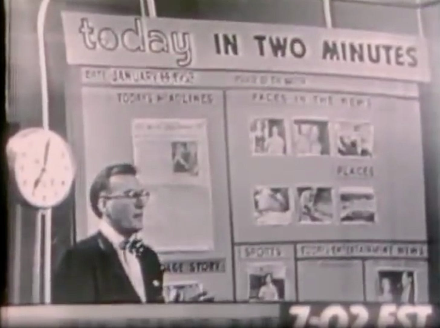
TODAY’s first broadcast: Jan 14, 1952
The look of TV news evolved with changes in technology in the 1970s and ‘80s. Character generators were used to show text on screen, such as an anchor’s name. These devices were expensive and bulky, and early on, the graphics they produced had to be pre-made. That changed in 1977 with the release of the Chyron IV, a character generator that offered real-time graphics, a graphical user interface, and a wider selection of typefaces. Today the word “chyron” has become the generic term for text shown on the lower third of the screen, but it actually started as the name of a company. Chyron was named after the centaur Chiron in Greek mythology who taught heroes like Hercules and Achilles, and the company originally set out to make educational toys for babies before getting into computer graphics.
CNN launched in 1980 as the first 24-hour news network. TV news at the time was shifting away from film — which took time to be developed, edited, and cut — to videotape. The need to fill 24 hours led to the rise of pundits, which were cheaper to produce than original reported segments, and required additional visual interest. “People don’t want to sit there and just listen to a talking head, especially if they’re trying to discuss something that involves statistics, like sports scores, or the stock market results, or even the weather,” said Roi Agneta, who started working at Chyron as an engineer in 1973.
CNN’s overall look was more a product of the new news cycle it ushered in than an intentionally created design, said Melanie Goux, who worked as a graphic designer at the network when it launched. “Nobody really had the time to sit through and say, ‘this is what we’re going to look like,’” she said. “You just did things and put them on the air. Somehow the whole collective sort of became its own look. A lot of that look was a function of the equipment, the lack of time, the personalities involved, the limited source material, the limited assets. There were practical realities that shaped the aesthetic qualities of the early material.”
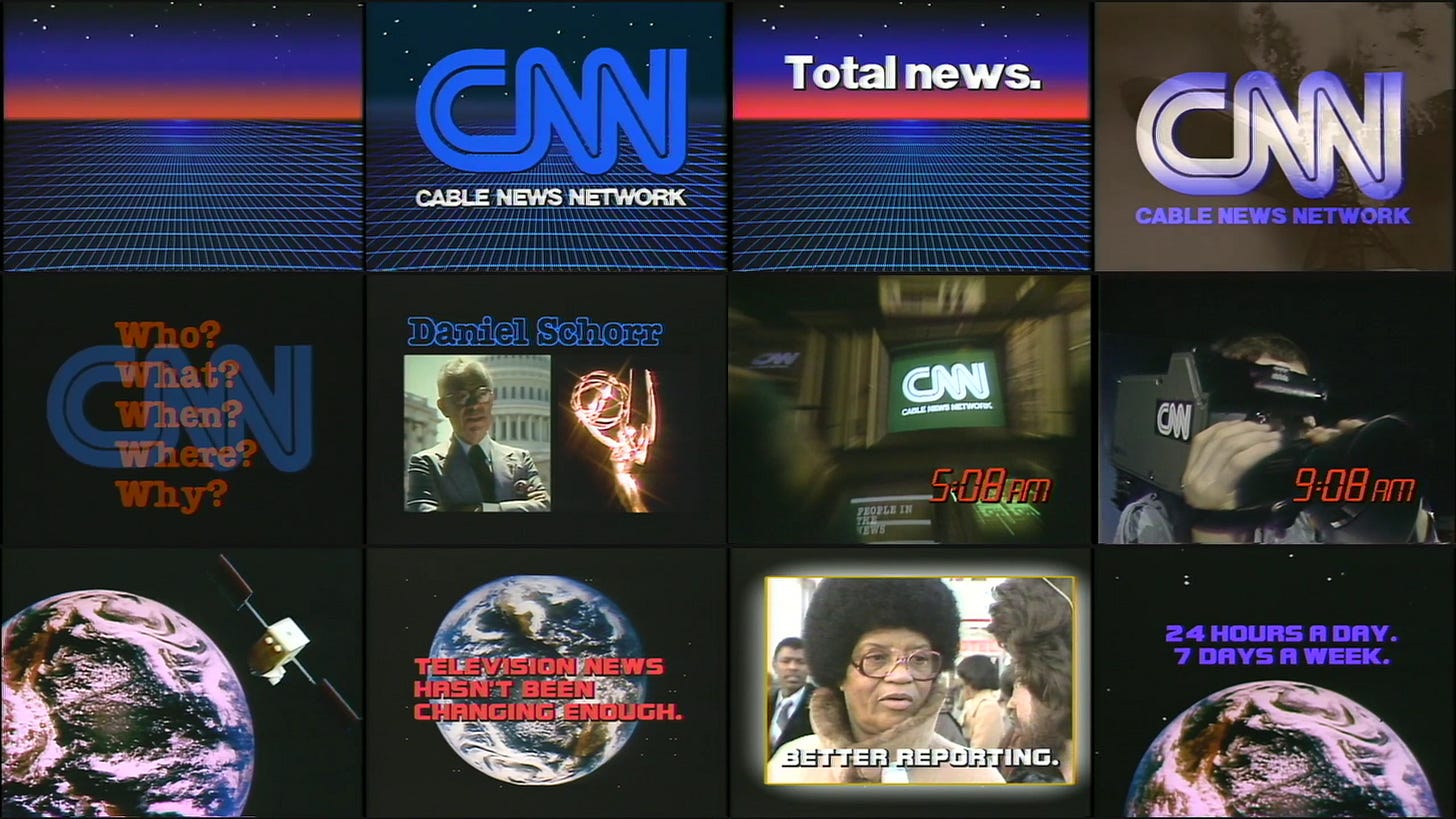
Select frames from a 1979 CNN sales presentation
Goux later started a company that provided news graphics to stations across the country, and her clients wanted dynamic, flashy graphics. “I cannot tell you how many times over the years I’ve had people tell me that the logo was too small, that the motion was too slow, that there wasn’t enough depth, it was too flat,” she said. “I mean, that seemed to be the big thing. Flatness seemed to be the enemy. You couldn’t have anything that actually looked two-dimensional.”
Many Americans were first introduced to CNN via airport televisions, and eventually cable found its way onto TVs in bars and restaurants, too. “In those circumstances, in public circumstances, the TV is on but it’s muted, so TV news becomes a purely visual media instead of an audio-visual medium,” said Andrew Tyndall, the publisher of the Tyndall Report, which tracks network nightly newscasts.
Competition also drove changes in visual aesthetic, with Fox News and MSNBC launching in 1996. “When you study old CNN, it’s really jarring because it never would have occurred to them to say something is breaking news,” said Lisa Napoli, author of Up All Night: Ted Turner, CNN, and the Birth of 24-Hour News. “When they started, it was just them, and the minute there became competition, they had to think about things differently than they did when they were the only game in town.”
On rare occasions, news events forced design innovations. High-profile legal cases in the 1990s, like the O.J. Simpson trial, turned the court room into a TV studio, and trial coverage was transformed from reporting on events after the fact into live coverage. The scrolling news ticker — previously used for weather updates, sports scores, and stock information — became a regular cable news fixture after it was deployed by the networks to cover the terrorist attacks on September 11, 2001. They’ve only since fallen out of use in recent years in an effort to declutter the screen, though the pandemic has brought them back for some shows.

Storm surge segment on the Weather Channel: September 13, 2018
This current moment has revealed TV news no longer has a monopoly on broadcasting like it once did. Social media has been used to show events people believe they can’t get on TV, like LeBron James, who retweeted video of peaceful protests in Denver, writing “Media showing this????,” and Fox News was criticized for airing footage of looting and violent protests weeks after it happened. In Wisconsin, a bystander filmed an MSNBC Crew covering the Memorial Day crowds to callout a cameraman whose face mask had fallen down around his neck. TV has resources and experience that citizen journalists won’t, but it still must content with the democratization of broadcasting.
On CNN, its coverage has sometimes felt like reality TV news. Anchor Chris Cuomo has interviewed his governor brother, correspondent Omar Jimenez and his crew were arrested live in Minneapolis while cameras were rolling, and the network covered Atlanta protests that breached the CNN Center lobby from inside the building
Future innovations to TV news design could be influenced by things like the size of smartphones, which could force newsrooms to design for smaller screens, making the text-heavy look a thing of the past. In 2018, a Weather Channel segment ahead of Hurricane Florence showed the possibilities of augmented reality to visualize the news by using an immersive green-screen to show the dangers of rising waters during a storm surge.
Entertainment features like Amazon Prime’s X-Ray, which gives viewers in-screen access to information about a show’s actors, music, and trivia, could have applications in news by offering viewers the option to go more in-depth on a story or view additional footage, photos, and documents. The future of news, some predict, will be interactive. “Suppose that you could have a dashboard for your television news experience and you could have a throttle … for things like, let’s throttle back on the sensationalism this week and see what happens, let’s throttle back on the heavy graphics that are always promoting the next emergency,” said Kovarik, the professor. “Wouldn’t it be great if we could have more control?”
This story is a collaboration between Yello and Eye on Design, a publication from AIGA that covers the world’s most exciting designers and the issues they care about. You can subscribe to the newsletter here.
This article originally appeared in AIGA’s Eye on Design.
Many guests no longer speak to us in front of in-studio green screens with professional makeup and lighting, but are instead beamed in from home offices on laptop cameras. Shaky cell phone video of demonstrations and police taken by protesters has in many cases been more compelling than the network-shot footage. The look of TV news has become more raw and real, and though many of these changes are temporary, some professionals think it could signal the beginning of a longer-term evolution.
“Most of my TV colleagues will kill me when I say this, but I’ve been under the opinion for quite a while that the consumer doesn’t really care if a guest is coming to us from a consumer-grade camera,” said Marc Greenstein, senior vice president of creative production and design at MSNBC. Greenstein said there’s a time and place for highly produced interviews. “You’re doing a sit-down with the president, no you’re probably not going to do that on an iPhone if you can avoid it,” he said. But improvements in camera quality as well as the rise of internet video and livestreaming have made the DIY studio look more acceptable. “More people consume YouTube on any given day than probably all news media properties combined,” he said. “I just think the consumer is accepting of those kinds of things.”
 Lester Holt @LesterHoltNBC
Life working on the home front.
April 1st 2020
59 Retweets638 Likes
The at-home aesthetic is just the latest evolution in the visual style of TV news. Today, newscasts are designed to convey the top stories even on mute and to keep us from changing the channel. They shout for our attention with animated lower third graphics and countdown clocks, offering a news-watching experience that’s information-heavy, addictive, and often anxiety-inducing. It hasn’t always looked like this, though, and it might not look the same for long because of changing technology and media habits. With more choice and control than ever before, viewers could have a say in whether the busy, dynamic look of TV news stays or evolves.
Early TV news wasn’t much to look at. Its forerunner was the newsreel, short narrated films about current events popular in the 1930s and ’40s that played at theaters between performances and movies. In 1939, NBC aired the first televised news program, hosted by radio and newsreel journalist Lowell Thomas. “The guys who started off in the television news business were radio guys,” said Bill Kovarik, a professor at Radford University and author of Revolutions in Communication. “There were not a lot of visual artists to start out with.”
Early graphics consisted of printed posters or images shown on television screens installed in the background of newscast sets. Later, graphics were shown via art cards placed in front of live video cameras, or they were played back through a switcher, equipment that allowed newscasts to switch between live video sources. For images, news programs relied on magazines well into the late ’80s. Interns would clip and file magazine graphics by topic, like food, aircraft, or location. Due to copyright restrictions, images would be manipulated or colorized in a way to make them unrecognizable before they made it to air.

TODAY’s first broadcast: Jan 14, 1952
The look of TV news evolved with changes in technology in the 1970s and ‘80s. Character generators were used to show text on screen, such as an anchor’s name. These devices were expensive and bulky, and early on, the graphics they produced had to be pre-made. That changed in 1977 with the release of the Chyron IV, a character generator that offered real-time graphics, a graphical user interface, and a wider selection of typefaces. Today the word “chyron” has become the generic term for text shown on the lower third of the screen, but it actually started as the name of a company. Chyron was named after the centaur Chiron in Greek mythology who taught heroes like Hercules and Achilles, and the company originally set out to make educational toys for babies before getting into computer graphics.
CNN launched in 1980 as the first 24-hour news network. TV news at the time was shifting away from film — which took time to be developed, edited, and cut — to videotape. The need to fill 24 hours led to the rise of pundits, which were cheaper to produce than original reported segments, and required additional visual interest. “People don’t want to sit there and just listen to a talking head, especially if they’re trying to discuss something that involves statistics, like sports scores, or the stock market results, or even the weather,” said Roi Agneta, who started working at Chyron as an engineer in 1973.
CNN’s overall look was more a product of the new news cycle it ushered in than an intentionally created design, said Melanie Goux, who worked as a graphic designer at the network when it launched. “Nobody really had the time to sit through and say, ‘this is what we’re going to look like,’” she said. “You just did things and put them on the air. Somehow the whole collective sort of became its own look. A lot of that look was a function of the equipment, the lack of time, the personalities involved, the limited source material, the limited assets. There were practical realities that shaped the aesthetic qualities of the early material.”

Select frames from a 1979 CNN sales presentation
Goux later started a company that provided news graphics to stations across the country, and her clients wanted dynamic, flashy graphics. “I cannot tell you how many times over the years I’ve had people tell me that the logo was too small, that the motion was too slow, that there wasn’t enough depth, it was too flat,” she said. “I mean, that seemed to be the big thing. Flatness seemed to be the enemy. You couldn’t have anything that actually looked two-dimensional.”
Many Americans were first introduced to CNN via airport televisions, and eventually cable found its way onto TVs in bars and restaurants, too. “In those circumstances, in public circumstances, the TV is on but it’s muted, so TV news becomes a purely visual media instead of an audio-visual medium,” said Andrew Tyndall, the publisher of the Tyndall Report, which tracks network nightly newscasts.
Competition also drove changes in visual aesthetic, with Fox News and MSNBC launching in 1996. “When you study old CNN, it’s really jarring because it never would have occurred to them to say something is breaking news,” said Lisa Napoli, author of Up All Night: Ted Turner, CNN, and the Birth of 24-Hour News. “When they started, it was just them, and the minute there became competition, they had to think about things differently than they did when they were the only game in town.”
On rare occasions, news events forced design innovations. High-profile legal cases in the 1990s, like the O.J. Simpson trial, turned the court room into a TV studio, and trial coverage was transformed from reporting on events after the fact into live coverage. The scrolling news ticker — previously used for weather updates, sports scores, and stock information — became a regular cable news fixture after it was deployed by the networks to cover the terrorist attacks on September 11, 2001. They’ve only since fallen out of use in recent years in an effort to declutter the screen, though the pandemic has brought them back for some shows.

Storm surge segment on the Weather Channel: September 13, 2018
This current moment has revealed TV news no longer has a monopoly on broadcasting like it once did. Social media has been used to show events people believe they can’t get on TV, like LeBron James, who retweeted video of peaceful protests in Denver, writing “Media showing this????,” and Fox News was criticized for airing footage of looting and violent protests weeks after it happened. In Wisconsin, a bystander filmed an MSNBC Crew covering the Memorial Day crowds to callout a cameraman whose face mask had fallen down around his neck. TV has resources and experience that citizen journalists won’t, but it still must content with the democratization of broadcasting.
On CNN, its coverage has sometimes felt like reality TV news. Anchor Chris Cuomo has interviewed his governor brother, correspondent Omar Jimenez and his crew were arrested live in Minneapolis while cameras were rolling, and the network covered Atlanta protests that breached the CNN Center lobby from inside the building
Future innovations to TV news design could be influenced by things like the size of smartphones, which could force newsrooms to design for smaller screens, making the text-heavy look a thing of the past. In 2018, a Weather Channel segment ahead of Hurricane Florence showed the possibilities of augmented reality to visualize the news by using an immersive green-screen to show the dangers of rising waters during a storm surge.
Entertainment features like Amazon Prime’s X-Ray, which gives viewers in-screen access to information about a show’s actors, music, and trivia, could have applications in news by offering viewers the option to go more in-depth on a story or view additional footage, photos, and documents. The future of news, some predict, will be interactive. “Suppose that you could have a dashboard for your television news experience and you could have a throttle … for things like, let’s throttle back on the sensationalism this week and see what happens, let’s throttle back on the heavy graphics that are always promoting the next emergency,” said Kovarik, the professor. “Wouldn’t it be great if we could have more control?”
This story is a collaboration between Yello and Eye on Design, a publication from AIGA that covers the world’s most exciting designers and the issues they care about. You can subscribe to the newsletter here.
This article originally appeared in AIGA’s Eye on Design.
