Latest Thread
- Spain The Saeta II Program
- #Asymmetric #Warfare: #Strategies, Tools, Scope, Time, and Lessons from #History
- Pakistan Pakistan’s secret Hellfire R9X Bladed missile Strike in Nimruz
- USA Read White House Correspondents’ Dinner gunman Cole Allen’s full anti-Trump manifesto
- Breaking News Tensions between the UK and the US
You are using an out of date browser. It may not display this or other websites correctly.
You should upgrade or use an alternative browser.
You should upgrade or use an alternative browser.
Actually it seems like Flir doesn't limit the gun elevation, unlike what we've thought before
This the NATO Hind.
TF6000 will yield a turbo shaft that will power a plane like an Osprey, that will output 6-7000HP per engine. (please see ~7000lbf RR3007 engine from which 6000lbf T406 engine is produced)Do we think TEI is going to convert the TF6000 core to a 3000+shp turboshaft engine? I remember Mr.Aksit talking about pre-studies being done for the TS-3000 and how the plan then was to even develop an engine with greater power. This way we would have the perfect engine for the T-929 and T-925.
He had also mentioned last year that they started working on the TF6000 two years ago, so around Q3/4 2020. The above statement was made in 2021, so from the timetable it would fit. Who knows maybe at IDEF23 we will see some surpises.
The proposed TS3000 turbo shaft, delivering 3000HP could be a derivative of the Blackhawk engine, T700-TEI-701D. There is a version of this engine that delivers 3000HP already in the States. We just have to design one that is similar in output and doesn’t conflict with the US version from legal point of view.
Last edited:
Five rotor blades,did i see that right?
Yes. The revised design has 5 blades, which was one difference from the initial design and mockup.Five rotor blades,did i see that right?
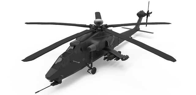
Hind is one of the 3 best looking attack helicopters (ah1, ah64)This the NATO Hind.
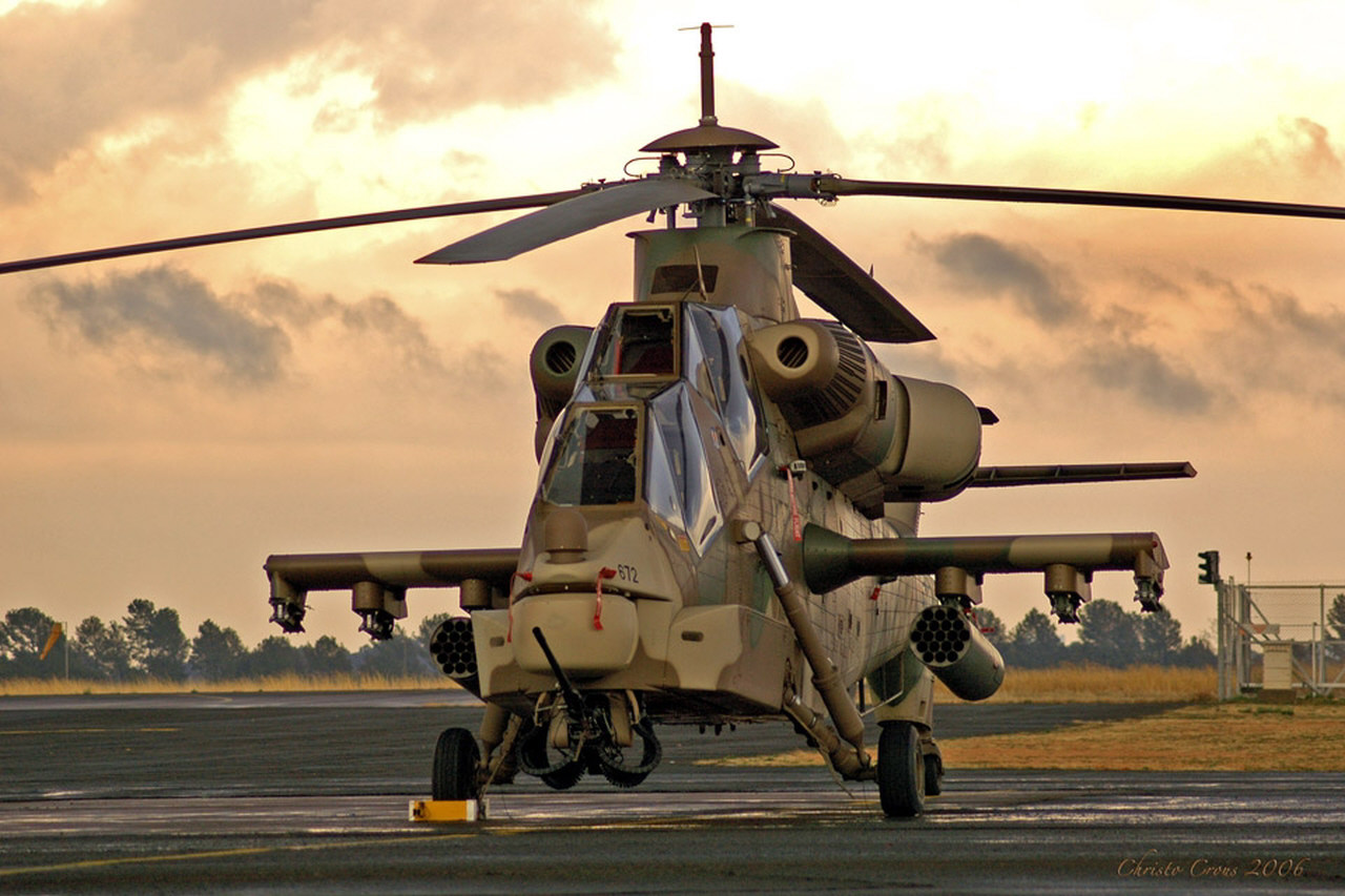
This one is Turkish Rooivalk. Even uglier
I always liked the Rooivalk. I think the squated big heli look fits heavy attack choppers. No need to be "aerodynamically beautiful" for them.Hind is one of the 3 best looking attack helicopters (ah1, ah64)
This one is Turkish Rooivalk. Even uglier
Mehmed Ali
Contributor
What unbelievable few days , I will never forget this . One thing is clear to me , a nation has to have high quality character to achieve these things.
It looks ugly because the images so far are distorted as all hell.
They squished a 16:9 image into square format and then bent it 45 degrees or something, it looks like a bad picture of a paper document.
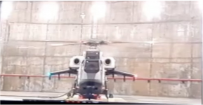
So I did some photoshop-fu. Here's an image capture from the engine start video:
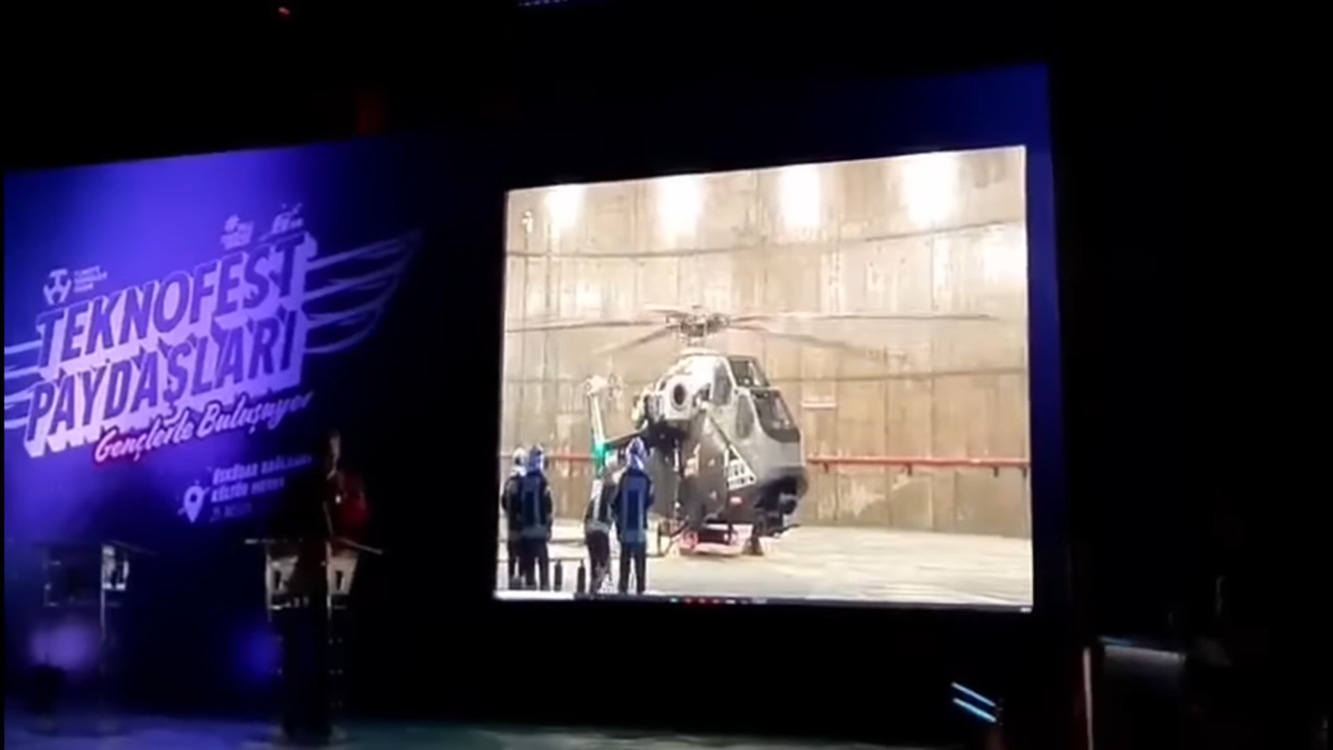
And here's the same image, with its "spine straightened out" to the best of my abilities
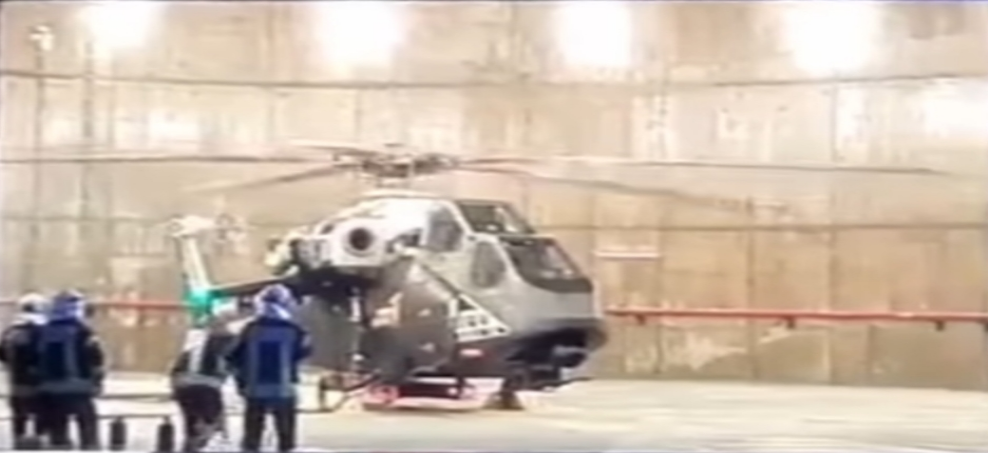
I'd say it looks fine. Kinda looks like a futurized Apache.
They squished a 16:9 image into square format and then bent it 45 degrees or something, it looks like a bad picture of a paper document.
So I did some photoshop-fu. Here's an image capture from the engine start video:
And here's the same image, with its "spine straightened out" to the best of my abilities
I'd say it looks fine. Kinda looks like a futurized Apache.
Attachments
Last edited:
Angry Turk !!!
Contributor
Don't you think that the front looks quite different than the Mock-up?It looks ugly because the images so far are distorted as all hell.
They squished a 16:9 image into square format and then bent it 45 degrees or something, it looks like a bad picture of a paper document.
So I did some photoshop-fu. Here's an image capture from the engine start video:
View attachment 56607
And here's the same image, with its "spine straightened out" to the best of my abilities
View attachment 56608
I'd say it looks fine. On par with the mock-up and kinda looks like a futurized Apache.
Baryshx
Contributor
Yeah, it's quite different. From the front it looks a bit like a fish.Don't you think that the front looks quite different than the Mock-up?
Really, I don't mind. As long as we have our own helicopter.
They mounted the cannon and the FLIR ball further back and tapered the nose downwards. Probably to increase the visibility.Don't you think that the front looks quite different than the Mock-up?
Khagan1923
Contributor
It looks ugly because the images so far are distorted as all hell.
They squished a 16:9 image into square format and then bent it 45 degrees or something, it looks like a bad picture of a paper document.
So I did some photoshop-fu. Here's an image capture from the engine start video:
View attachment 56607
And here's the same image, with its "spine straightened out" to the best of my abilities
View attachment 56608
And here's the most recent mock-up for comparison. The entire FLIR ball section looks tacked-on.
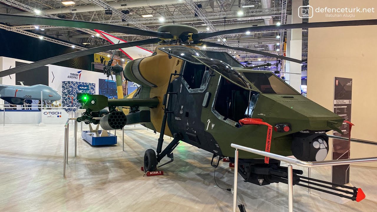
I'd say it looks fine. On par with the mock-up and kinda looks like a futurized Apache.
This mock-up is of the old design which was supposed to be outfitted with two General Electric T700-701D at the time. Once TAI made the switch to ukrainian engines with more power ~3000shp the design changed.
Don't know why they continued to show this mock-up off even though it has nothing to do with the current design anymore, sadly.


